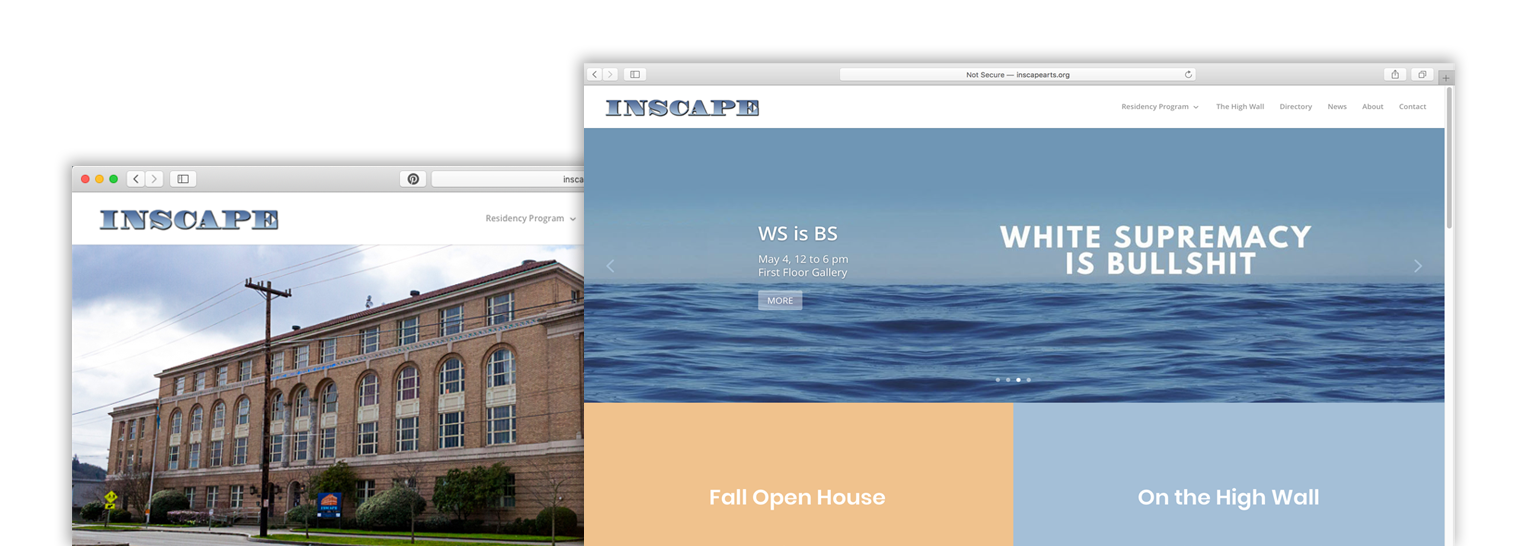
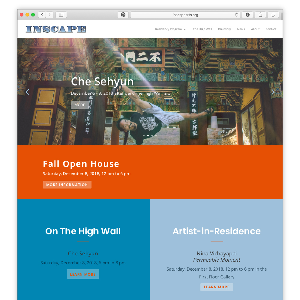
Brief: Inscape Arts, a Seattle artist studio building, was expanding its programing to include an Artist Residency, a project space and the High Wall events. The website was out of date, and could not easily accommodate the new elements. The overhauled site needed to showcase the building events and new programing, reflect branding, and be easily navigable for users. And it needed a strategy and structure for new posts.
Challenge: Had to be a quick and dirty overhaul: Minimal budget, minimal staff for ongoing maintenance, minimal existing branding and brand guidelines.
Team: Building manager, Building Marketing lead, and High Wall and Artist Residency Leads
Role: Project lead, designer, and I continue to manage the site.
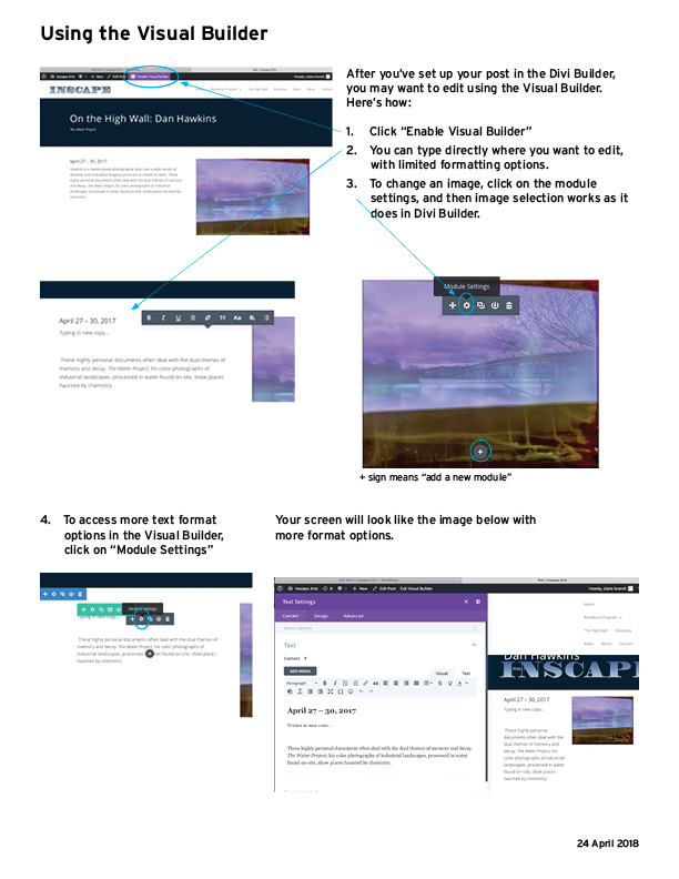
Solution: Developed information architecture, styled and designed site to work with and expand existing brand guidelines. Also developed Wordpress tutorial materials and gave instruction for inexperienced users.
Effect: Inscape’s site is organized, attractive, up-to-date and functional—offering the Seattle art community pertinent and clear information about one of the largest artist studio buildings in the city
Skills
Information architecture
Project Management
Wordpress
Photography
Photoshop
Teaching
Set Up
- Outlined site structure.
- Chose a new, dynamic and highly customizable Wordpress theme for the site: Elegant Themes’ Divi.
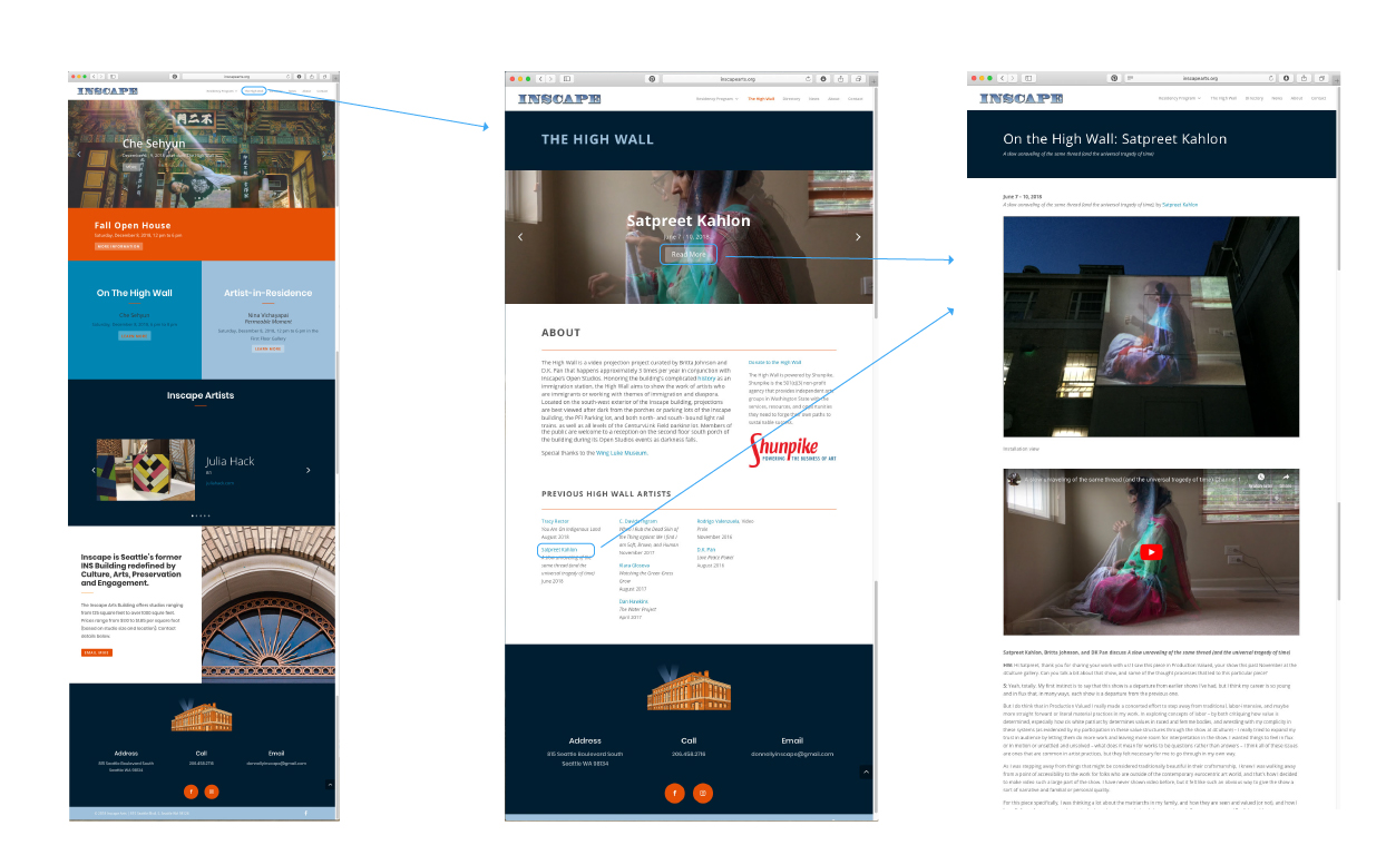
- Set up category structure so that posts would feed into the appropriate pages: Residency, High Wall, News.
Design
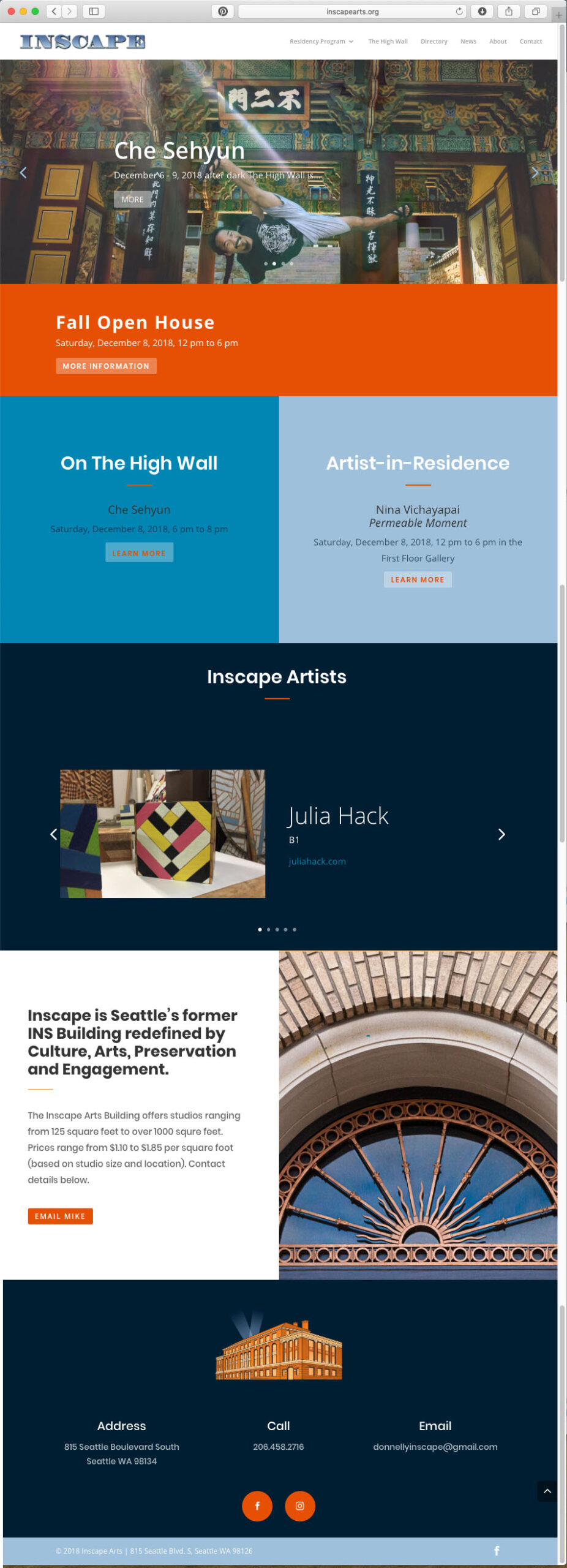
Extrapolating from existing Inscape branding, I extended brand across the site, focusing on building itself. I photographed the building to create imagery. Set up post, slider relationship so that artist imagery is hero.
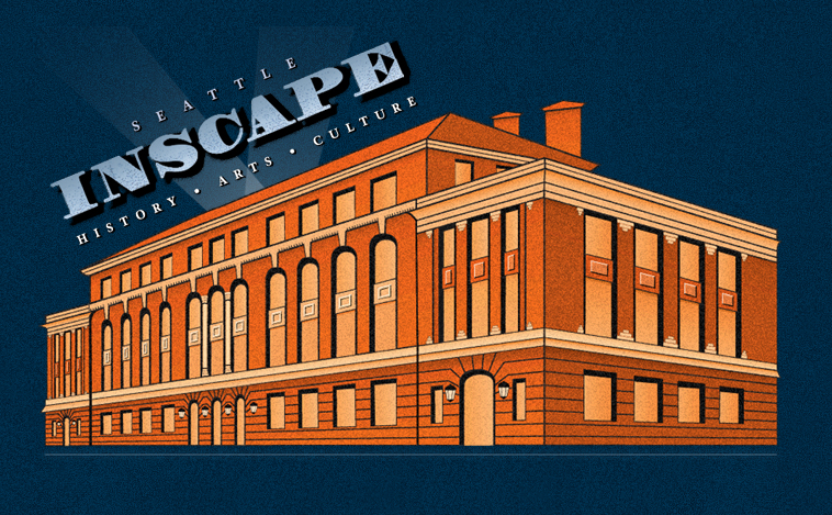
Existing Branding
Photographed Building

Home
About the High Wall
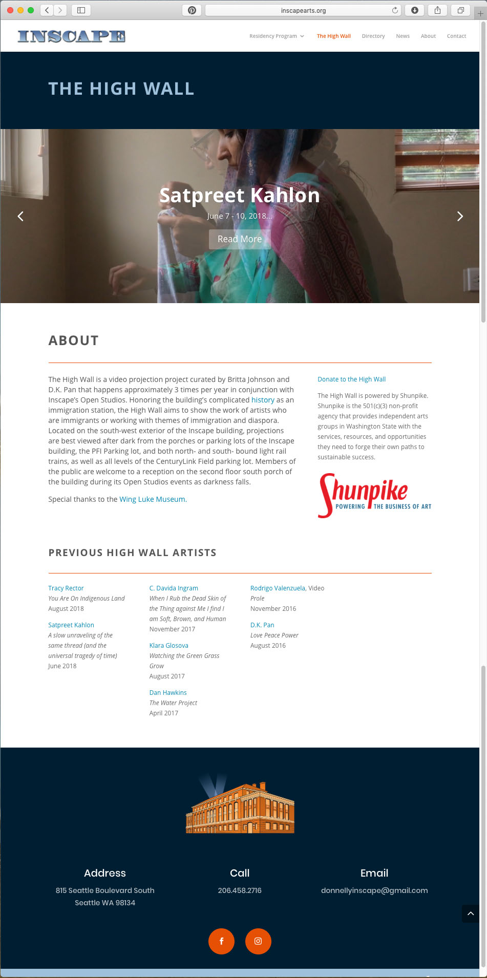
Residency Program
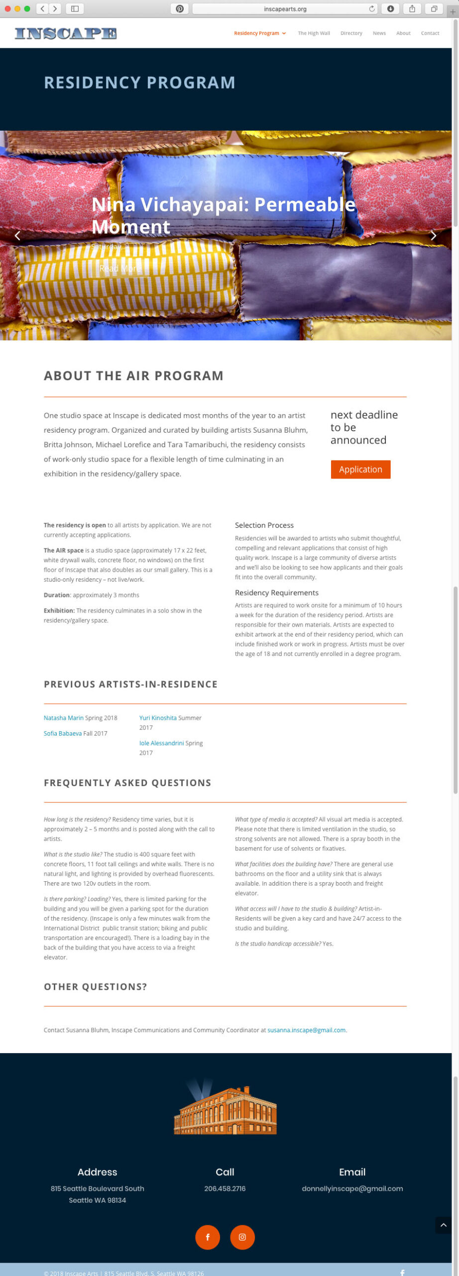
Into the Future
- Developed education materials for team download pdf. Performed tutorials for team.
- Ongoing updates and maintenance of site
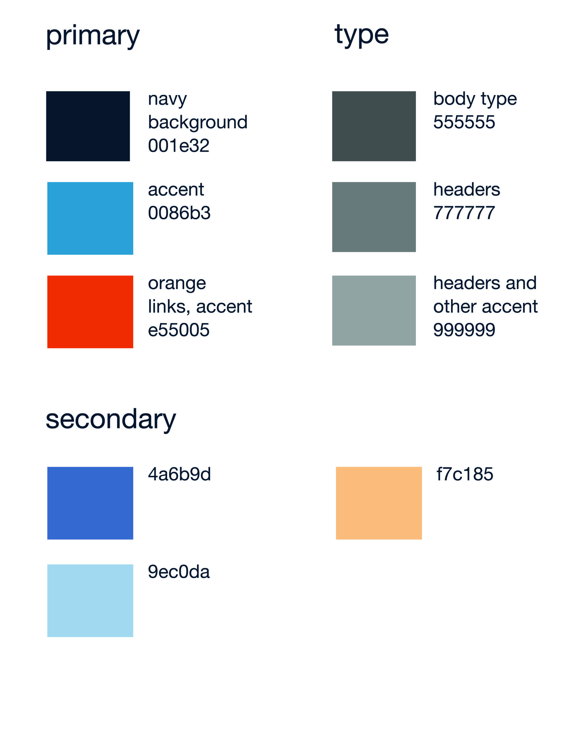
Brand definition
Working within Brand on Wordpress
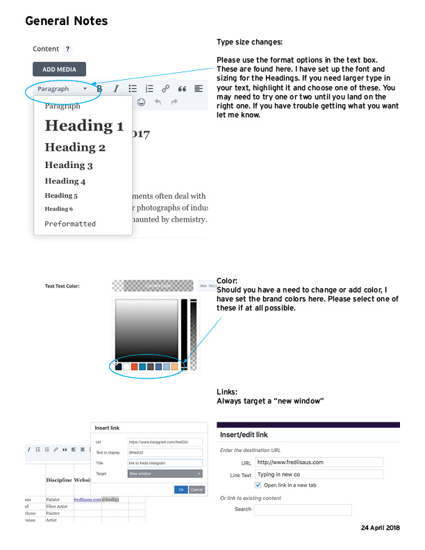
Post Set-up
Selected Works
Inscape ArtsUi/UX

Lane Powell Brand RolloutBranding
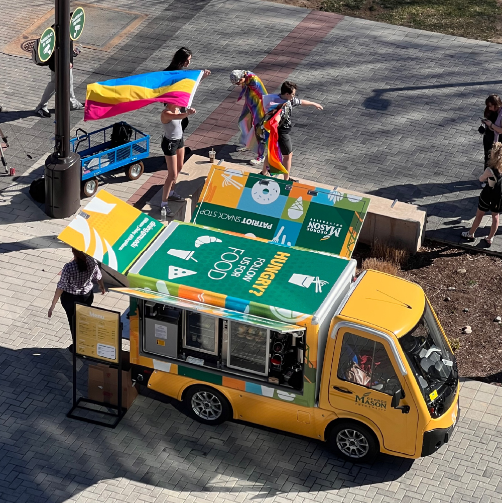
Mason Dining GodegasBranding
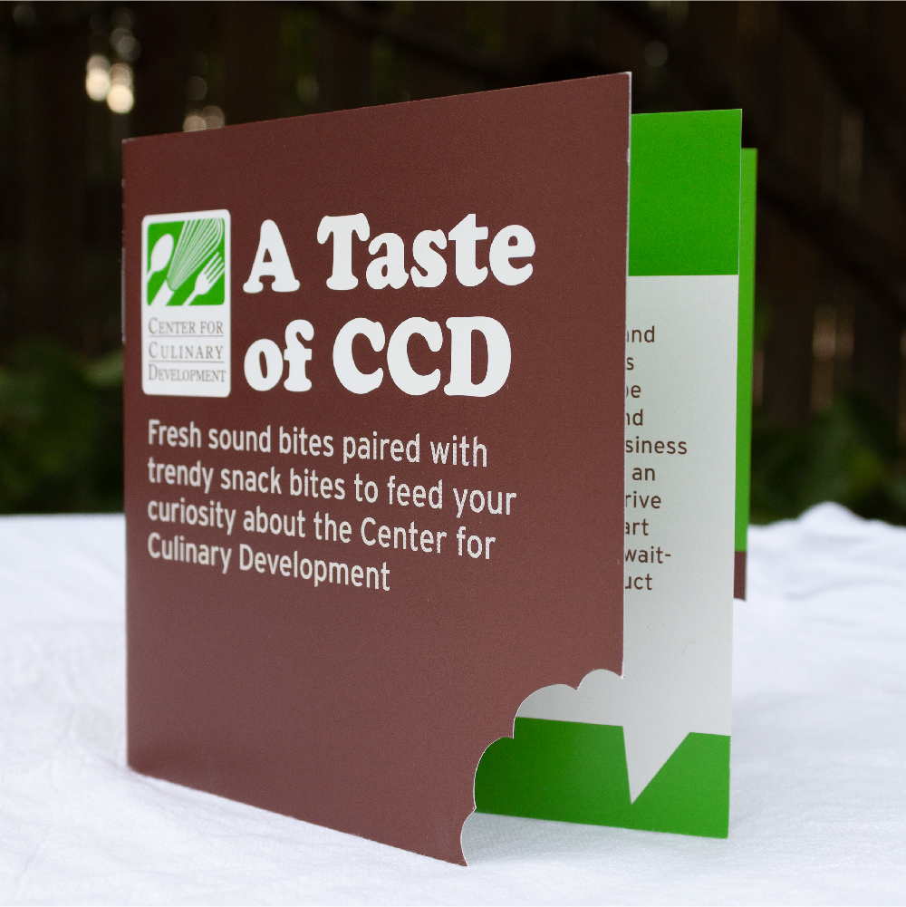
CCD MailersB2B Print Marketing

